https://www.typescriptlang.org/
JavaScript With Syntax For Types.
TypeScript extends JavaScript by adding types to the language. TypeScript speeds up your development experience by catching errors and providing fixes before you even run your code.
www.typescriptlang.org
typesrcipt는 개발자가 할 수 있는 사소한 실수들을 코드 실행 전에 잡아주는 유용한 도구이다.
맛보기로 살펴보자면,
const plus = (a, b)=> a+b;라는 함수가 있을 때 number끼리만 더하고 싶을 경우,
변수의 자료형(type)을 javascript만으로는 체크해줄 수 없다.
const plus = (a: number, b: number)=> a+b;
이렇게 typescript를 사용해 타입을 명시하면 코드 실행 전에 잘못된 자료형이 들어갔을 경우를 체크해주어 잘못된 실행 결과를 내놓는것을 방지할 수 있다.
[typescript 설치하기]
1) 작업폴더 처음부터 새로 생성하는 경우
npx create-react-app my-app --template typescript
2) 기존 작업폴더에서 typescript 기능을 사용하고 싶을 경우
npm install --save typescript @types/node @types/react @types/react-dom @types/jest
terminal창에 해당 명령어 입력 후, 파일 확장자 *.tsx로 변환하기.
[Typing the Props]
어떻게 우리 자신과 props를 interface를 사용해 보호하는지에 대한 내용이다.
앞서, typescript를 사용한다면, 변수들의 자료형(type)을 명시적으로 기술해야한다고 말했 듯,
컴포넌트에서 props를 전달할 때도 당연히 해당 props에 대한 type을 명시해줘야 한다.
해당 과정을 수행하는 방법에 대해 알아보자.
<App.tsx>
import React from 'react';
import './App.css';
import Circle from './Circle';
function App() {
  return (
    <div>
      <Circle bgColor="teal"/>
      <Circle bgColor="tomato"/>
    </div>
  );
}

export default App;
App.tsx 파일에서 Circle 컴포넌트를 사용할 때, bgColor라는 props를 내려주려고 한다.
<Circle.tsx>
Circle 컴포넌트가 정의되어있는 Circle.tsx 페이지이다.
코드를 전체적으로 살펴보면, interface라는 코드가 보인다.
interface는 object가 어떤식으로 보일지 설명해주는, 즉 object 에서 내려받는 props들이 어떤 자료형을 갖는지 정의해놓은
type 명시 코드라고 보면 된다.
import React from "react";
import styled from "styled-components";
const Container=styled.div<ContainerProps>`
width:200px;
height:200px;
background-color:${props=>props.bgColor};
`;
interface ContainerProps{
bgColor:string;
}
interface CircleProps{
bgColor:string;
}
function Circle({bgColor}:CircleProps){
return <Container bgColor={bgColor} />
}
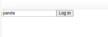
interface PlayerShape{
name:string;
age:string;
}
const sayHello=(playerObj:PlayerShape)=>`Hello ${playerObj.name}, you are ${playerObj.age} old.`
sayHello({name:"panda", age:"12"});
export default Circle;
Circle 안에는 Container라는 컴포넌트가 사용된다.
Circle의 props(bgColor)는 Container의 props(bgColor)로 전달이 된다. 각 컴포넌트의 props type을 명시하는 법을 알아보자.
1) interface 작성하기
다시 한번 말하지만,
interface는 object 에서 내려받는 props들이 어떤 자료형을 갖는지에 대한 type을 명시해주는 코드이다.
Circle과 Container 둘 다 bgColor라는 Props 하나를 가지기 때문에 아래와같이 interface를 작성해준다.
전달받는 props가 여러개라면, 여러개 변수에 대한 type 정의를 작성해주면 된다.
2) props type 명시하기
앞에서 작성했던 interface를 이용해 컴포넌트 props들의 자료형을 명시해준다.
- function 형식으로 정의된 경우: ({propsName}:interfaceName) 형식으로 작성
혹은
- arrow func 형식으로 정의된 경우: styled.{propsName}<interfaceName>` ` 형식으로 작성
위 흐름을 전체적으로 한번 다시 작성해보면 아래와 같다.
interface PlayerShape{
    name:string;
    age:string;
}

const sayHello=(playerObj:PlayerShape)=>`Hello ${playerObj.name}, you are ${playerObj.age} old.`

sayHello({name:"panda", age:"12"});
[Optional Props]
props를 선택적으로 전달하는 방법에 대해 알아보자.(props를 전달해도 되고, 안해도 되도록)
위에서 작성한 props들은 모두 required 속성을 가진다.
interface에 props 정의해놓고, 컴포넌트에서 전달해주지 않으면 에러메시지가 뜬다는 뜻이다.
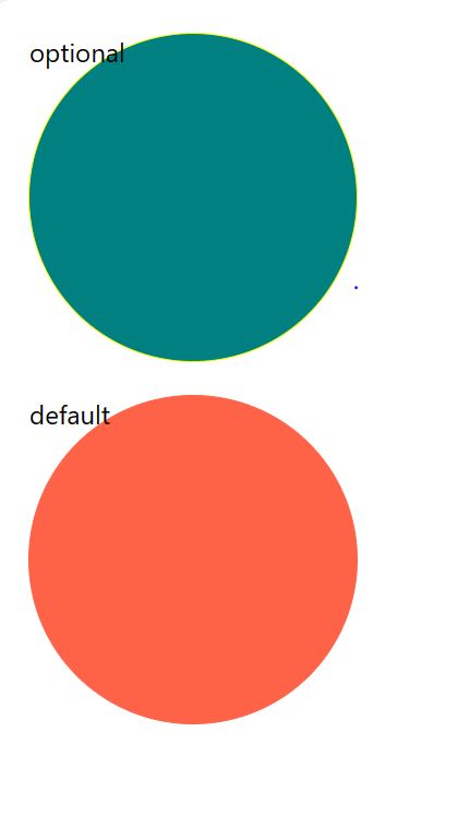
만약 두개의 Circle 컴포넌트 중 하나에만 테두리 효과를 주고싶으면 어떻게해야할까?
props 전달을 optional하게 선택할 수 있도록 하면 된다. 테두리를 주고싶을때만 borderColor={"yellow"}; 이런식으로
테두리 색을 전달해주면 될 것이다.
<Circle.tsx> 파일
Step 1) interface에 변수 추가
interface에 변수를 추가할 때, optional한 변수라는 것을 표기하기 위해선 {propsName} ? : {type} , 변수명 뒤에 물음표를 붙이면 된다.
Step 2) 컴포넌트 정의부에 해당 항목 추가
border속성에 대한 값을 props로 받아올 것이기 때문에, 컴포넌트 정의부에 border에 관한 css 속성을 추가한다.
기존에 작성하던 대로 작성해주면 된다.
Step 3) optoinal props의 default값 설정
borderColor를 전달받지 못했을 때(optional한 속성이기 때문) borderColor의 default값을 설정하는 법은 아래와 같다.
{propsName} ?? {default 속성값} 형식으로
default값을 ??뒤에 적어주면 된다.
아래는 코드 수정 전문이다. 출력 결과와 코드를 비교하면서, optional한 prop이 default값 혹은 전달받은 값이
잘 적용되어 나타났는지 비교해보자.
import React from "react";
import styled from "styled-components";
const Container=styled.div<ContainerProps>`
    width:200px;
    height:200px;
    border-radius:50%;
    margin:20px;
    background-color:${props=>props.bgColor};
    border: 1px solid ${(props)=>props.borderColor};
`;

interface ContainerProps{
    bgColor:string;
    borderColor?:string;

}

interface CircleProps{
    bgColor:string;
    borderColor?:string;
    text?:string;
}

function Circle({bgColor, borderColor,text="default"}:CircleProps){
    return <Container bgColor={bgColor} borderColor={borderColor ?? bgColor}>{text}</Container>
}


export default Circle;
[State]
React에서 사용하는 useState 훅에서는 typeScript가 변수의 초깃값을 바탕으로 알아서 변수 자료형을 설정한다.
위같은 경우에는 초기 설정값이 number형이므로, setCounter()로 변수를 변경 시 number형 값만 올 수 있다.
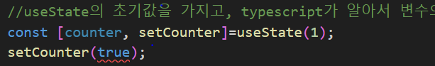
위처럼 boolean값을 넣으면, 에러메시지가 뜬다.
원한다면, counter의 자료형을 여러개 허용하도록 설정할 수도 있다.
사용할일이 많진 않지만, 아래처럼 올 수 있는 자료형을 복수개로 설정해 줄 수 있다.
useState< | >();
[Forms]

[Themes]
https://styled-components.com/docs/api#typescript
styled-components: API Reference
API Reference of styled-components
styled-components.com
themes 변경 typescript 사용해 적용하기
1) styled.d.ts 파일 생성
.d.ts는 정의 파일이다. 해당 이름의 파일을 src 폴더 밑에 생성하고, theme의 interface를 작성한다.
import 'styled-components';

declare module 'styled-components'{
    export interface DefaultTheme{
        textColor:string;
        bgColor:string;
        btnColor:string;
    }
}
2) theme.ts 파일 theme에 type 명시
각 lightTheme, darkTheme에 대해 styled.d.ts에서 정의한 interface를 사용해 type을 명시한다.
import {DefaultTheme} from "styled-components";

export const lightTheme:DefaultTheme={
    bgColor:"white",
    textColor:"black",
    btnColor:"tomato",
};

export const darkTheme:DefaultTheme={
    bgColor:"black",
    textColor:"white",
    btnColor:"teal",
};
해당 작업을 마치면, 테마 변경이 잘 작동할 것이다.
'웹공부 > React' 카테고리의 다른 글
| React에서 react-hook-form 사용하기 (0) | 2024.03.13 |
|---|---|
| React에서 Recoil로 상태관리하기 (0) | 2024.03.11 |
| React에서 styled components 사용하기 (1) | 2024.01.08 |
| React 공부 9일차 (0) | 2023.08.22 |
| React 공부 8일차 (0) | 2023.08.21 |


