본문 바로가기

웹공부/React

React 공부 8일차

React 입문자 강의로 리액트란 무엇인가에 대해 간단하게 찍먹하고,

본격적으로 React 공부를 시작해보려 한다.

터미널에 아래 코드를입력해 새 react project를 만들어주었다.

npx create-react-app react-masterclass

Styled Components

이걸 사용하기 전에는 style을 아래 3가지 방법을 이용해 적용해왔다.

1) styles.css 파일을 js 파일에 import해서 style 적용

2) html 태크에 style 속성을 직접 입혀줌

3) css module 사용: className이 겹쳐도 상관이 없다는게 큰 장점

${fileName}.module.css -> 모듈 안의 className들을 object의 속성인 것처럼 사용하면 됨.


1) Styled Components 설치

터미널에 npm i styled-components 입력

2) styled-components import 하기

import styled from "styled-components";


css를 사용한 경우 vs styled-components를 사용한 경우 

function App() {
  return (
  <div style={{display:"flex"}}>
    <div style={{backgroundColor: "teal", width: 100, height: 100}}></div>
    <div style={{backgroundColor: "tomato", width: 100, height: 100}}></div>
  </div>
  );
}

export default App;

css 사용

import styled from "styled-components";
const Father = styled.div`
  display: flex;
`;

const BoxOne = styled.div`
  background-color: teal;
  width: 100px;
  height: 100px;
`;

const Text = styled.span`
color: white`
const BoxTwo = styled.div`
  background-color: tomato;
  width: 100px;
  height: 100px;
`
function App() {
  return (
  <Father>
    <BoxOne>
      <Text>Hello</Text>
    </BoxOne>
    <BoxTwo />
  </Father>
  );
}

export default App;

styled.{html 태그명}`{css 코드}`

주의: `는 single quote(')가 아니라 backtick(`)을 사용해야 함.

styled-components 적용

구현부 가독성이 훨씬 좋아졌다.

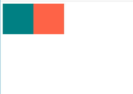
근데 BoxOne, BoxTwo가 배경색 빼고는 코드가 똑같으니까 효율이 떨어진다.


background-color를 component에서 지정하지않고, App() 구현부 코드에서 색을 선택할 수 있도록 할 순 없을까?

const Box = styled.div`
  background-color: ${(props)=>props.bgColor};
  width: 100px;
  height: 100px;
`;

->${(props)=>props.bgColor};

function App() {
  return (
  <Father>
    <Box bgColor="teal"/>
    <Box bgColor="tomato"/>
  </Father>
  );
}

=><Box bgColor="teal" />

이렇게 하면, 컴포넌트에서 배경색을 지정하지 않고, 설정변경이 가능한 component를 만들었다.

inspect 탭을 가보면, 임의로 클래스명이 주어진 것을 볼 수 있다.

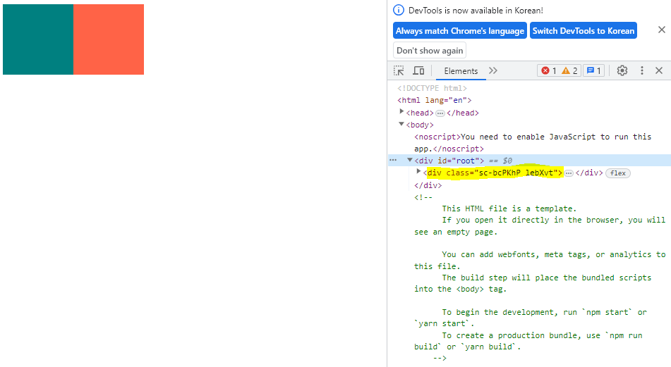
그저 props를 보냈는데, styled-components가 알맞게 className을 만들었다고 보면 된다.
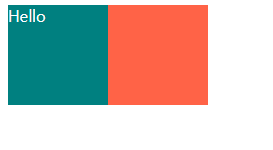
 

컴포넌트 확장하기

기존 컴포넌트에 새로운 속성을 추가해 컴포넌트를 확장 시키려면 어떻게 해야할까?

import styled from "styled-components";
const Father = styled.div`
  display: flex;
`;

const Box = styled.div`
  background-color: ${(props)=>props.bgColor};
  width: 100px;
  height: 100px;
`;

const Circle= styled(Box)`
  border-radius: 50px;
`;

function App() {
  return (
  <Father>
    <Box bgColor="teal"/>
    <Circle bgColor="tomato"/>
  </Father>
  );
}

export default App;

=>styled.{(기존 component 이름)}`{추가할 속성에 대한 css 코드}`

Box 컴포넌트에서 border-radius가 추가로 적용된 Circle 컴포넌트


style 일부 요소를 다르게 적용하는 법은, 위에서 배웠다.

이번에는 style을 그대로 적용하되, html 태그만 바꿔 쓰임새를 다르게 하고 싶다.

import styled from "styled-components";
const Father = styled.div`
  display: flex;
`;

const Btn = styled.button`
color: white;
background-color: tomato;
border: 0;
border-radius: 15px
`
function App() {
  return (
  <Father as="header">
    <Btn>Log in</Btn>
    <Btn as="a" href="https://naver.com" target="_blank">Naver</Btn>
  </Father>
  );
}

export default App;

그럴 때는 만들어놓은 component에 <tagName as="{새롭게 적용하고자 하는 html tag명}">으로 적어주면 된다.

>>> as=" " <<< 이 방식을 기억하자!

style은 그대로 적용하되, tag만 바꿈.


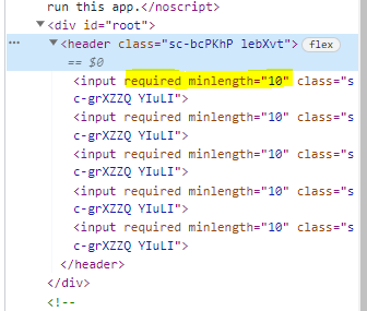
이번에는 input 태그 속성에 required: true, minLength: 10, maxLength: 15를 주고 싶다.

<Input /> 태그를 5개 만들 건데,

<Input required/>

뭐 대략 이런식으로 5줄 모두 속성을 적기 너무 귀찮다. 그래서 아예 component를 생성할 때, 기본적으로 해당 속성들이

부여되도록 만들어 줄 것이다. 

const Input = styled.input.attrs({required: true, minLength: 10, maxLength: 15})`
  background-color: tomato;
`;

function App() {
  return (
  <Father as="header">
    <Input/>
    <Input />
    <Input />
    <Input />
    <Input />
  </Father>
  );
}

const Input = styled.attrs({부여하고자 하는 속성들})` `

styled 뒤에 점을 찍고 atributes를 의미하는 attrs({ }) 중괄호 안에 부여하고자 하는 속성들을 적어주면 된다.
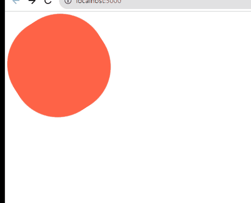
보다시피 inspect창에서 보면, 모든 input 태그의 지정해준 속성이 default로 들어가있는 것을 볼 수 있다.


 ----------------------------------------------------------------------------------------------------------------------------------------------------------------


Animation


이번에는 component에 animation을 넣는 방법에 대해 알아보자.


import styled, {keyframes} from "styled-components";

const Wrapper = styled.div`
display: flex;
`
const rotationAnimation = keyframes`
  0% {
    transform: rotate(0deg);
    border-radius: 0px;
  }
  50% {
    transform: rotate(360deg);
    border-radius: 100px;
  }
  100%{
    transfrom: rotate(360deg);
    border-radius: 0px;
  }
`;

const Box = styled.div`
  height: 200px;
  width: 200px;
  background-color: tomato;
  animation: ${rotationAnimation} 2s linear infinite;
`

function App() {
  return (
  <Wrapper>
    <Box />
  </Wrapper>
  );
}

export default App;

1) keyfrarmes를 import한다.

2) keyframes 키워드 뒤에 ``(backticks)를 쓰고 적용할 animation을 설정한다.(styled.keyframes가 아니라 그냥 keyframes)

3) animation을 적용할 component에 animation: ${지정한 animation 이름}을 추가한다.

        +) 그리고 해당 animation을 몇초간 어떻게 적용할 것인지 지정해줘야 한다.

           animation: ${rotationAnimation} 2s linear infinite;                            

animation이 적용된 모습

hover(css)는 사용자가 포인팅 장치를 사용해 상호작용 중인 요소를 뜻한다.
쉽게는 사용자의 커서(마우스의 포인터)가 요소에 올라가 있을 때 적용된다.


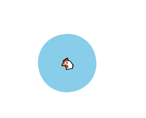
이제 저 회전하는 도형 안에 emoji를 넣고 싶다.

모든 component를 styled 처리 해 줄 필요 없이, 그냥 한 component만 styled 처리해주고 <span>emogi<span>에 

대해서는 target 처리해서 워하는 애니메이션 효과를 적용할 수 있다.


import styled, {keyframes} from "styled-components";

const Wrapper = styled.div`
display: flex;
height: 100vh;
width: 100vw;
justify-content: center;
align-items: center;
`
const rotationAnimation = keyframes`
  0% {
    transform: rotate(0deg);
    border-radius: 0px;
  }
  50% {
    transform: rotate(360deg);
    border-radius: 100px;
  }
  100%{
    transfrom: rotate(360deg);
    border-radius: 0px;
  }
`;

const Box = styled.div`
  height: 200px;
  width: 200px;
  background-color: skyblue;
  display: flex;
  justify-content: center;
  align-items: center;
  animation: ${rotationAnimation} 2s linear infinite;
  span {
    font-size: 36px;
    // psudo selector
    &:hover{
      font-size: 50px;
    }
    // click하고 있는게 active 상태
    &: active {
      opacity: 0;
    }
  }
 
`

function App() {
  return (
  <Wrapper>
    <Box>
      <span>🐔</span>
    </Box>
  </Wrapper>
  );
}

export default App;

Wrapper에 styled 속성을 추가하여 도형이 웹브라우저 화며면 가운데로 오도록 조정을 좀 했다.

이건 중요한게 아니고


1) Box의 styled 속성에 span{ } 코드를 추가해, <Box></Box>태그 사이에 span이 추가될 경우 해당 span에 적용할

몇가지 속성을 지정했다.


hover(css)는 사용자가 포인팅 장치를 사용해 상호작용 중인 요소를 뜻한다.
즉, 사용자의 커서(마우스의 포인터)가 닭 이모지에 닿아있을 때 적용된다.

active는 emogi를 클릭하고 있는 상태를 말한다. active 상태일때는 opacity(불투명도)가 0이 되어 닭 이모지가 일시적으로 보이지 않도록 설정했다.

+) span{ } 중괄호 안에서는 &:hover = span:hover로 코드를 간소화해서 적을 수 있다.

2) App() 함수 안 구현 코드에서 <Box> 컴포넌트 안에 <span>🐔</span>을 추가하여 target의 style을 적용시켰다.

animation이 적용된 모습


이번에는 styled component 안의 element를 선택하는 또 다른 방법에 대해 알아보자.

위에서는 span{ } 코드를 Box 컴포넌트 안에 추가함으로써 span 태그에 의존적이었다.

이모지의 html 태그가 p나 a같은 다른태그로 바뀐다면, 효과가 적용되지 않는다는 ㄸㅅ이다.


이모지에 효과를주는 걸 html 태그에 의존하지 않고 Box component에 Emoji component를 직접적으로 targeting할 수

있는 방법이 있다.


const rotationAnimation 이하 코드를 다음과 같이 수정한다.

const Emoji = styled.span`
  font-size: 36px;
`
const Box = styled.div`
  height: 200px;
  width: 200px;
  background-color: skyblue;
  display: flex;
  justify-content: center;
  align-items: center;
  animation: ${rotationAnimation} 2s linear infinite;

  ${Emoji} {
    // psudo selector
    &:hover{
      font-size: 50px;
    }
    // click하고 있는게 active 상태
    &: active {
      opacity: 0;
    }
  }
 
`

function App() {
  return (
  <Wrapper>
    <Box>
      <Emoji as="p">🐔</Emoji>
    </Box>
    <Emoji as="span">🐶</Emoji>
  </Wrapper>
  );
}

export default App;

1) Emoji를 const로 지정하여 styled-components를 적용한다.

2) Box component 안의 span{} => ${Emoji}{}로 변경한다.

3) App() 컴포넌트에서 <span> 태그를 Emoji로 변경한다.

        =>적용된 애니메이션을 보면, Emoji 태그가 <p /> tag로 변경되어도 효과가 그대로 적용된다.

적용된 animation

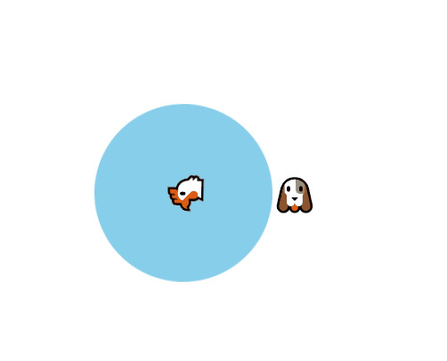
☆Emoji에 대한 효과는 Box component 안에 정의되어있으므로,

Box component에서 벗어난 🐶 이모지는 애니메이션 효과가 적용되지 않는다.★


 ----------------------------------------------------------------------------------------------------------------------------------------------------------------


Themes

Theme은 기본적으로 모든 색상들을 가지고 있는 object이다.


Theme을 사용하기위해선 index.js 파일에서 몇가지를 적용해줘야 한다.

1) ThemeProvider import 하기

import {ThemeProvider} from "styled-components";

2) 속성을 가진 theme을 정의 (나는 dark모드와 light모드 두가지 버전을 번갈아 적용해 볼 것이다.)

const darkTheme = {
  textColor:"whitesmoke",
  backgroundColor: "#111"
}

const lightTheme = {
  textColor:"#111",
  backgroundColor: "whitesmoke"
}

3) App 컴포넌트를 <ThemeProvider> 태그로 감싸기

const root = ReactDOM.createRoot(document.getElementById('root'));

root.render(
  <React.StrictMode>
    <ThemeProvider theme={lightTheme}>
      <App/>
    </ThemeProvider>
   
  </React.StrictMode>
);

이렇게 해주면,

App이 ThemeProvider 안에 위치하기 때문에, 우리의 component들이 theme에 정의된 색에 접근할 수가 있다.


import styled from "styled-components";
const Title = styled.h1`
color: ${(props) => props.theme.textColor};
`;

const Wrapper = styled.div`
display: flex;
height: 100vh;
width: 100vw;
justify-content: center;
align-items: center;
background-color: ${(props)=>props.theme.backgroundColor};
`;


function App() {
  return (
  <Wrapper>
    <Title>Hello</Title>
  </Wrapper>
  );
}

export default App;

Title과 Wrapper는 App 컴포넌트 안에 위치하고, App 컴포넌트는 ThemeProvider 안에 위치하므로 Title이 theme에 접근할 수 있다.

=> color: ${(props) => props.theme.textColor};

=>background-color: ${(props)=>props.theme.backgroundColor};


***아까 index.js 파일에서 theme을 lightTheme으로 설정해놨기 때문에, lightMode로 글자가 나타난다.***

<ThemeProvider theme={lightTheme}>

lightTheme이 적용된 Title

***아무것도 건들지 말고, theme만 darkTheme으로 바꿔주면, dark모드가 적용된 Title이 나타난다.***

<ThemeProvider theme={darkTheme}>

darkTheme이 적용된 Title

theme이 가진 속성은 모두 동일해야한다. 객체의 속성 이름과 개수가 반드시 모두 동일해야한다.

그래야 코드 하나만 바꿔주면(theme={ } 부분) light모드, dark 모드를 변경하듯이

앱 전체 스타일에 변화를 줄 수 있다는 걸 기억하자!!

'웹공부 > React' 카테고리의 다른 글

React에서 styled components 사용하기  (1) 2024.01.08
React 공부 9일차  (0) 2023.08.22
React 공부 7일차  (0) 2023.08.18
React 공부 6일차  (0) 2023.08.17
React 공부 5일차  (0) 2023.08.15